How to set up your church’s front page for success.
|
|
Your website is the digital front door to your audience. Make it easy for them to walk through.
Everyone thinks the front page of their website needs to be the flashiest thing on the face of the planet. After all, that is what people have come to expect in our media-driven culture. However, that is not true for your expected audience.
Your website is a tool primarily for your external audience: the people you intend to reach. Because of that, the people that are frequently visiting your website are those looking for quick answers, not for everything thrown at them all at once.
Based on our research, people are mostly looking for:
- The name and brand of the church.
- When service times are and how they can get there.
- Contact information, just in case they have questions.
Seems underwhelming, right?
Here’s the thing: Everything below the initial screenshot of the first page that loads is engaged with less than 30% of the time. That means that the majority of the time, your audience is only engaging with the things they immediately see upon initial load: the hero section and main menu. Take it a step further, and you will find out that 92% of a user’s engagement is done on the main menu. Kind of kills your amazing website buzz, doesn’t it?
People just want answers, answers to the above three things, and that’s it. It’s your job to give it to them as fast as possible, and in a way that they can easily take their next right step with.
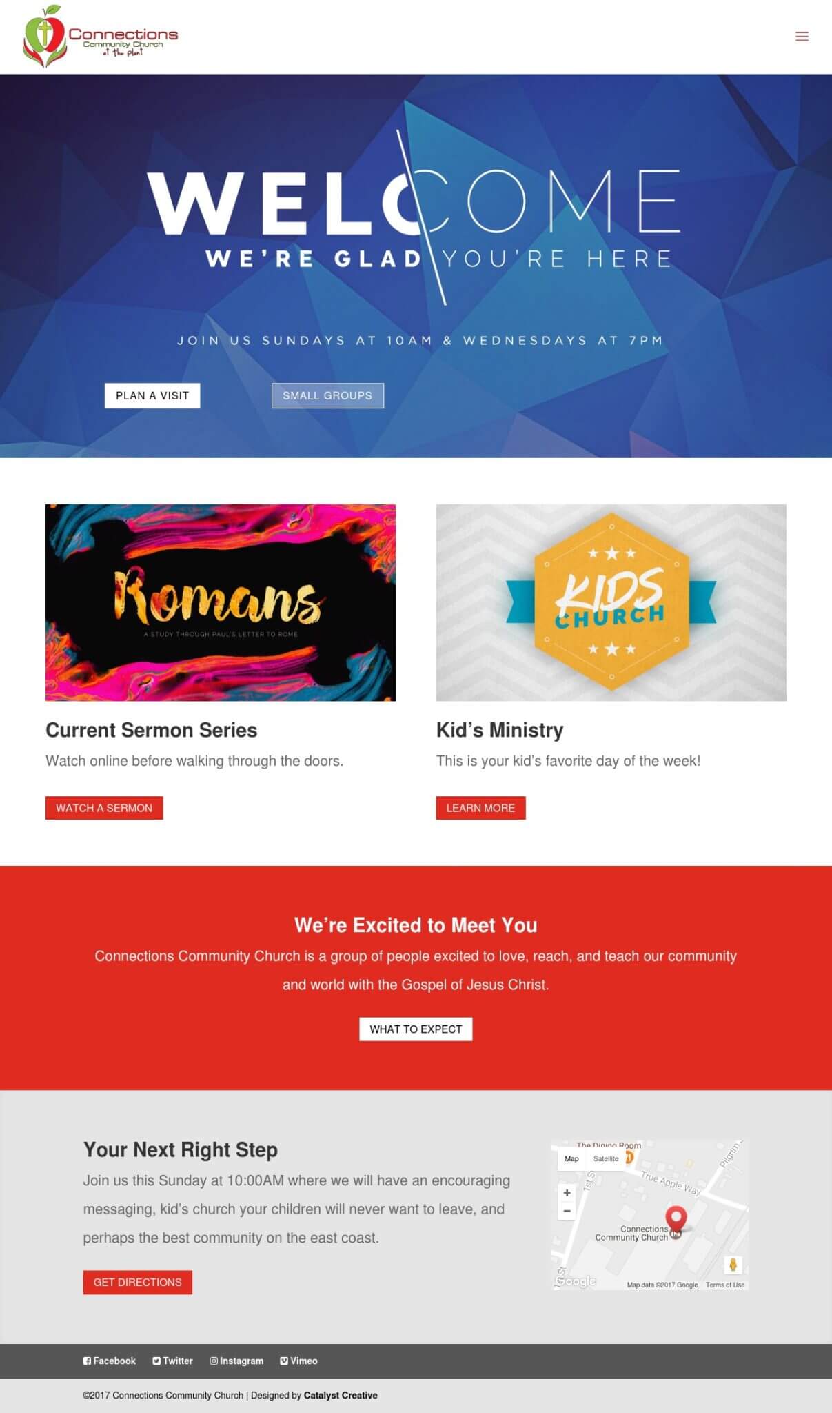
You can see how Connections Community Church in West Virginia is adhering to these rules by visiting their website or viewing the image below. You can also take these tips on the road with you and download our new ebook, Church Website Best Practices: Seven Steps to Improving Your Online Presence.